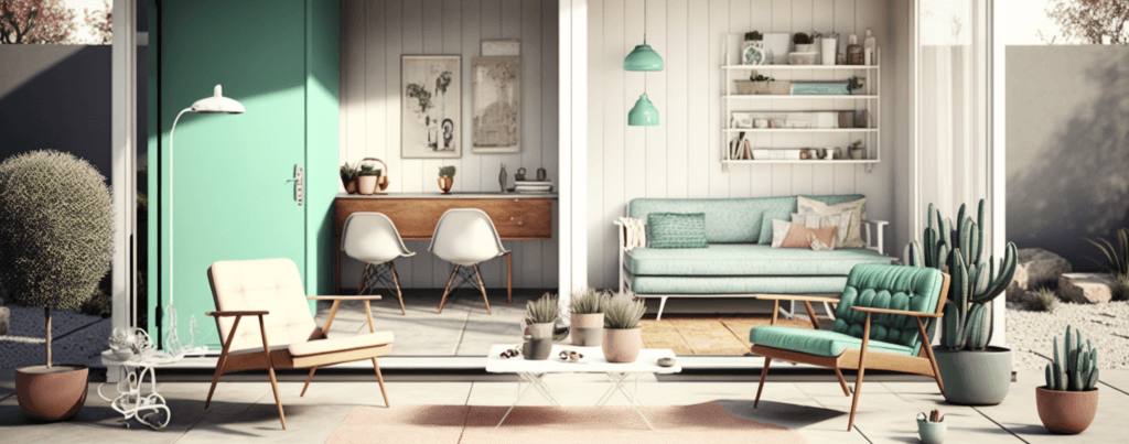
The Open House Analogy

Imagine walking into an open house. Everything is neatly arranged, the furniture is stylish, and the overall design is stunning. You can’t help but imagine living there. But then, you realize that once you move in with all your belongings, it won’t look like this anymore. This is the perfect analogy for using templates in design work.
Just like an open house, templates showcase the potential of a well-designed project. However, the reality is that our content and style are unique, and sometimes these templates don’t accommodate our specific needs. This can leave us with a project that falls short of the polished look we desire.
The Pros: Beautifully Designed and Time-Saving
Templates can be a blessing in disguise for those with limited design experience or time constraints. They offer a polished look, are customizable to an extent, and save time by providing a solid foundation. With a well-chosen template, you can achieve a professional result without starting from scratch.
Additionally, templates are available in various styles and formats, catering to a wide range of industries and preferences. This allows users to find a template that resonates with their target audience and brand identity. Furthermore, templates can help maintain consistency in design, which is crucial for branding and communication.
My Personal Struggle: When Templates Don’t Work
Despite the benefits, I’ve faced situations where templates simply don’t work. If the template’s design elements don’t accommodate my content, I’m left with a less than desirable outcome. Forcing copy or images to fit into a rigid template can lead to a cluttered or awkward appearance. One time, I found a stunning template with a bold title design. However, it only allowed for 4-5 words. My title was longer, and no matter how much I tried to tweak it, the result was underwhelming. It became apparent that using a template would require either sacrificing the message I wanted to convey or accepting a less visually appealing design.
The Cons: Rigidity and Lack of Cohesion
When working with templates, you often have to adhere to their parameters. When you deviate from these guidelines, you risk losing the template’s original charm. Additionally, adjusting a template can lead to a lack of cohesion, as elements may no longer align or work together harmoniously.
Templates can also stifle creativity, limiting your ability to explore different design approaches. This is especially true when a template is chosen purely based on its aesthetic appeal without considering its adaptability to your content. Ultimately, this can result in a generic, cookie-cutter appearance that fails to differentiate your project from others.
A Potential Solution: AI Assistance

The ideal solution would be an AI tool that adjusts the design based on your content, rather than forcing you to modify your content to fit the template. This would allow for a seamless blend of your unique copy and a polished design without compromising either aspect. Currently, such a tool doesn’t exist, but if it did, I would be the first one to test and use it. Until then, we’re left to navigate the pros and cons of templates and strive to find the perfect balance. It’s essential to keep an open mind and explore alternative design solutions that can provide the flexibility and customization needed for a truly personalized project.
The ideal solution would be an AI tool that adjusts the design based on your content, rather than forcing you to modify your content to fit the template.
Striking the Perfect Balance
Templates can be both a blessing and a curse. They offer a professional starting point, but their rigidity can limit creativity and hinder the seamless integration of your content. Striking the perfect balance between using a template and customizing it to fit your needs is key.
As we wait for AI to potentially revolutionize the world of design, it’s essential to carefully consider the pros and cons of templates and evaluate whether they can truly accommodate your unique content. Sometimes, it’s worth investing extra time and effort to create a cohesive, tailor-made design that reflects your vision.
When deciding whether to use a template, consider the following:
- Assess the adaptability of the template to your specific content and design requirements.
- Determine if the template’s style aligns with your brand identity and target audience.
- Weigh the time-saving benefits against the potential limitations in creativity and flexibility.
By thoroughly evaluating these factors, you can make an informed decision about whether to use a template or create a custom design from scratch. Remember, the ultimate goal is to produce a visually appealing, engaging, and memorable project that speaks to your audience and accurately represents your unique message.
Embrace the challenge, trust your creative instincts, and strike the perfect balance between structure and creativity. With persistence and careful consideration, you can create a design that truly stands out and captivates your audience.
Do you want to read more topics like this? Check out these articles.
- Creating a Presentation Template: Why Your Small Business Needs It
- Don’t Let Your Next Presentation Fall Flat – Try These 6 Solutions
- The Future of Presentation Design: How AI is Leading the Way
- Me, Myself, and AI: How Artificial Intelligence is Helping My Business and Personal Life
- 12 Common Presentation Design Mistakes You Need to Avoid


